The concept of “data viz,” short for “data visualization,” has become increasingly common in recent years, yet it is still a relatively new field.
With the vast array of information and multitude of analytical tools available to everyone today, we are inundated with reports full of financial figures, performance stats, trends – in other words, data.
Data viz, or visual imaging, should make it easier to understand the data.
I wrote “should” because I come across so many visualizations that either misleading the viewer or oversimplify the information.
As someone who constantly deals with the need to gather information and translate it into the “language” of those who will view it – I think visual imaging at its best is a way of communicating between the analyst and the end user that is engaging, presents insights, and imparts wisdom.
If we think about it, in ancient times people used paintings to transmit information. In ancient cave paintings you can find drawings of animals that have been found in the area, their quantities, sizes, etc. In the more modern era, you can find visualizations of information, from 17th-century maps to the invention of the pie chart in the early 19th century to today’s dynamic visualizations.
The idea has always been to transfer potentially large amounts of data in a comprehensible way – analyzed and presented so that it will be understood by its intended audience.
One example of data visualization is a geographical , easily compare its location on the planet, the ratio of size and distance between it and all the others. Another example is a map of the planets. Even without understanding the true magnitudes of the bodies themselves, we can understand where the Earth is located, how big it is relative to the others, and the relative distance of each from the sun.
Regarding the pie chart, since its invention many more graphs have emerged –even some new ones in recent years. The more data there is, the more creative ways are needed to present it all clearly.
Because of the way the human brain processes information, using charts or graphs makes it easier to understand large amounts of complex data – it is much easier than understanding spreadsheets or reports.
Data visualization is a quick and easy way to convey concepts universally – sometimes even regardless of language and culture.
For example: electricity bills in Israel show usage figures comparing the different months of the year and the average consumption in the region.
This analysis can be easily understood both by someone who does not speak fluent Hebrew, and by someone who does not really like or know how to delve into numbers.
In the business world, the use of visual imaging is an important component of analyses such as identifying areas that need attention or improvement, illustrating factors that influence customer behavior, predicting sales volumes, comparisons between employee wages, and much more.
Not only quantitative data, but also qualitative data can be translated: customer satisfaction, quality assurance operations, employee satisfaction, etc.
Let’s assume we have data of all the company’s sales in the last year.
Here we need to consider several issues:
We need to consider a number of other factors as well: is the presentation a one-time thing or do we want it to be updated regularly? Which tool are going to you to present the data?
In my opinion, the main reason for unsuccessful imaging is the attempt to concentrate too much or too little information in a single visualization.
Another important reason is a misunderstanding of how the human brain perceives attitude, color, and form.
Data imaging requires familiarity with three areas: analytics, aesthetics and neuroscience.
Analytics – It is not enough to know how to analyze data. When imaging is made, it should bring insights and conclusions, not just an analysis of information
This is a sample of a very typical data set.
It can be found in any business. This data set can vary. Each column here can contain a different type of data:
Column 1 : Products, projects, serial numbers etc.
Column 2: Date of the transaction, sale, acquisition etc.
Column 3: Order id, sales person, division etc.
Column 4: Department, region, country, office, etc.
Column 5: The actual values: sales, units etc.
Column 6: in this case – profit.

The data originally included many lines of data – one line for each item sold.
A total of 2,032 rows can be reduced to 12 rows with a header row – this is a Pivot table that aggregates all the sales for each month.
It presents all the “big numbers” in K$ (divides to thousand, the number of thousands).
This way, we can make some sense out of the data.
Before – it was hard to tell what the numbers meant to the business. Now, we have something to start analyzing.
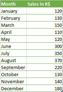
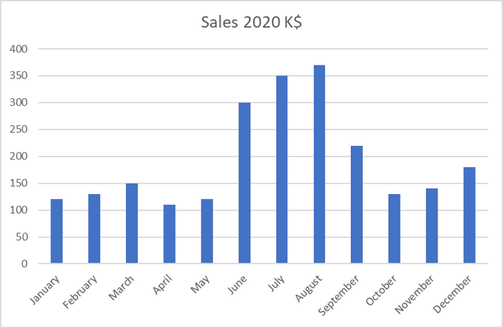
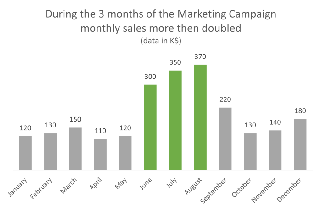
Chart “A” is a visual representation of the data in the pivot table above.
Do we get any new information? Yes – we can see clearly that there was a pick in sales during June, July & August.
Is there a story there? do we know what caused the pick? what did we do well and need to repeat?
In Chart ‘B”, there is a story:
We can see what insight the data presenter wants us to understand.
We understand what was th “turning point in the plot”, and we can have a plan for the future.
We know what needs to be done!
The presenter told us the whole story in a clear manner and gave us a workable plan – all in one chart!
We use cookies to improve your experience on our site. By using our site, you consent to cookies.
Manage your cookie preferences below:
Essential cookies enable basic functions and are necessary for the proper function of the website.
These cookies are needed for adding comments on this website.
Statistics cookies collect information anonymously. This information helps us understand how visitors use our website.
Google Analytics is a powerful tool that tracks and analyzes website traffic for informed marketing decisions.
Service URL: policies.google.com (opens in a new window)