Are we all seeing the same thing?
When planning a presentation – whether it is for a client with global connections, offices or clients, or for a global firm you work for – one should always take into consideration that the image deck we prepare needs to be appropriate for more than just one language.
Most of the time clients/bosses are not aware of the consequences of a great presentation being poorly adapted to another language. The same presentation can achieve totally different results.
We spend a lot of time finding the right message, finding the perfect image and a great slide layout. The client is very happy with our work, we are very satisfied and all appears to be perfect.
What neither one of us takes into consideration is that sometimes our client will be asked to translate the presentation. Now – translating is not a big issue. But when the local branches or agents need to present it in their native tongue – that is when the trouble begins.
First of all, there might be a problem with some images. A simple “thumbs up” might have other meanings in some cultures. Images with imprinted text might have no meaning at all in some cases.
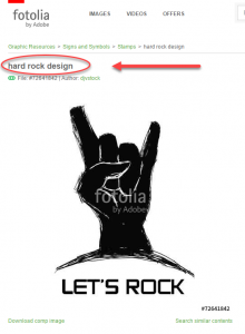
Here are a few examples. The images are from fotolia.com. I left the description of the photos just to show what they represent, the result of a search. Yes, most people will probably relate to them in a similar way, but not everybody.
 |  |
| The caption is “Forever” however, in my culture, it will probably look like a tussle, like a power struggle. | The caption is “Female Hands”. To others it might seem to be a either a “begging hand” or an “offering gesture”. |
 |  |
| Will people see “Hard Rock” or “Let’s Rock” or will they see the “Sign of the Devil”…. | One of my personal favorites: This might be the call for action in a presentation but to others, it can appear insulting – this is an accusing sign, blaming you for something. |
There are a few ways to tackle this problem:
- When preparing the image deck, duplicate slides that have meaningful images and make sure they are easy to replace. It would be great to attach the dimensions and any grids that are being used in order to facilitate exchange of images in the target market.
- It is preferable to use text boxes with inset images. This way the text can be edited without affecting the image itself.
- Discuss this issue with your client. The ideal solution is to delegate responsibility for the image decks to a local contact in each branch. If the client understands up front that presentations need adaptation in different languages he will be willing to invest the necessary funds.
Awareness is the first step.
There are a few more issues to address. Check my other articles here.


One thought on “Multicultural Presentations”