Is size not important?
How many languages are there? More than you think.
In a very interesting article – “How many languages are there in the world“? by Stephen R. Anderson, he states that ” As of 2009, at least a portion of the bible had been translated into 2,508 different languages, still a long way short of full coverage.”
I don’t think that a presentation should be as widely spread as the bible but I do believe that a good presentation should be planned to be given in more than just one language. For this purpose, the designer has to think “Multilingual”.
One master slide is not enough when presenting in more than one language. I will not write about Left to Right Languages in this article – I address this subject in my article “Thinking Multilingual – RTL or LTR”. This article covers two issues: Headers and Text Boxes.
Headers
Different languages, different lengths – these are just two of the challenges in multicultural presentation
When designing a header in PowerPoint, most of us look at the “Click to edit Master title style” as the reference point. This sentence represents the average number of words in an English Header, very well. So designing accordingly will look perfect in English and a lot of other European languages. I’ve used Google translate for the phrase. I don’t recommend using machine translation. This is an absolute “No no”. Also, I’m sure that each version of PowerPoint has a different phrase – as it should! This is exactly what I advocate – each language needs different consideration.
I want to show how the same phrase, when translated – appears visually different:
English: “Click to edit Master title style”
Spanish: “Hagaclic para modificar el estilo de título del patron”
Polish: “Kliknij, aby edytowaćstylwzorcatytułu”
Russian: “Нажмите, чтобыизменитьстильосновногозаголовка”
Chinese: 点击编辑母版标题样式
So, the translation is funny, at least the one in Spanish, one of the languages I understand. To those of you readers, who don’t understand – it says – “click to change the title of the boss”… If you needed a demonstration as to why not to use “Google Translate” – you just got it. However, I do encourage you to use it only to get a general idea of the language proportions when designing a multilingual presentation.
Different languages different fonts
Now let’s check the font issue. Again, I used “Google Translate” for the text and the default font style in the following slides:

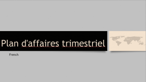


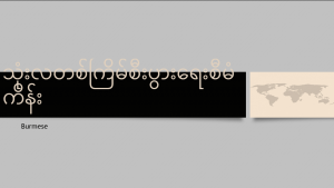
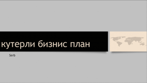
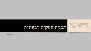

Even languages that use similiar fonts, such as Russian & Serb, English-French-Portuguese, use different space in the header.
Text Boxes
Let’s have a look at a text box. This time I took the English random text function in PowerPoint and translated it to other languages to see how these texts would fit into a divided slide.
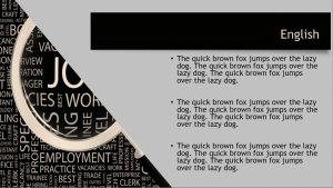


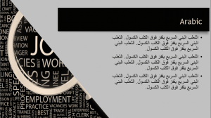


It might not look too bad. Maybe it’s not what we wanted. The Greek slide seems too cramped while that Chinese one is not filling the text box as we intended.
It is very hard to resolve these differences. Again, if we can – it is best to prepare the presentation in advance, with proper translation and EDITING! This is very important.
Possible Solutions:
- We can make a slide in the slide master where the image is smaller and the text box is larger. This will fit the “longer” languages. We should also do the opposite, for the “shorter” languages.
- We could edit the text differently. This will require a trained editor.
- Check the fonts you use. How will they look in other languages? Sometimes by selecting a font that is not as awesome as you wanted, the presentation will be more effective in other countries.
Awareness is the key. Even if we cannot design one template for all languages we can minimize compatibility issues at least in some of them.
Read another article, about images, and how they are precepted in different cultures


One thought on “Multicultural Presentations – Texts”